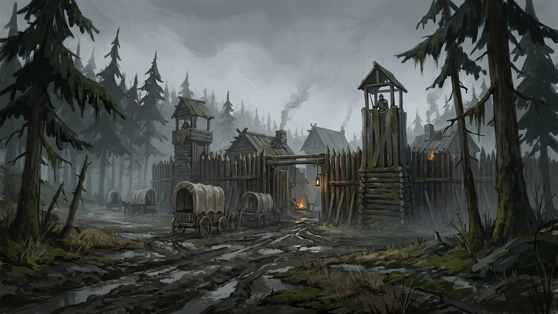
Finding the Visual Identity of Realms of Mordryn
- art-direction
- worldbuilding
For a long time, Mordryn didn’t look like anything in particular. Early environment passes borrowed a bit from photoreal fantasy concept art, a bit from flatter tabletop-map illustration, and the result was a game that looked different from one screen to the next. Nothing was wrong, exactly — but nothing was ours either.
The version of the game you’d see in a screenshot today comes from picking a lane and staying in it: stylized 2D illustrated fantasy, closer to Banner Saga than to a AAA concept-art portfolio. Simplified planes, graphic silhouettes, controlled painterly texture. Readable at a glance, even when a scene is busy.
What we stopped doing
The biggest gains came from what we cut, not what we added. We wrote it down as a standing rule for anything new entering the game:
- Not photorealistic, not “realistic portrait painting”
- Not gritty high-detail skin or hyper-rendered wrinkles
- Not over-modeled anatomy or noisy micro-texture
- Not cinematic realism, not oil-paint realism
Every one of those was something we’d actually tried and then had to walk back. Skin that looked great as a single splash image looked wrong sitting next to a simplified environment — the two styles were fighting each other for attention.
Environments as painted stage plates
Environments carry a lot of the visual identity, so we treat them like painted stage plates rather than fully rendered 3D scenes: stable composition, a horizon that stays put, low-to-moderate texture. The road below is a good example — mist, silhouetted pines, and the road itself doing most of the compositional work.
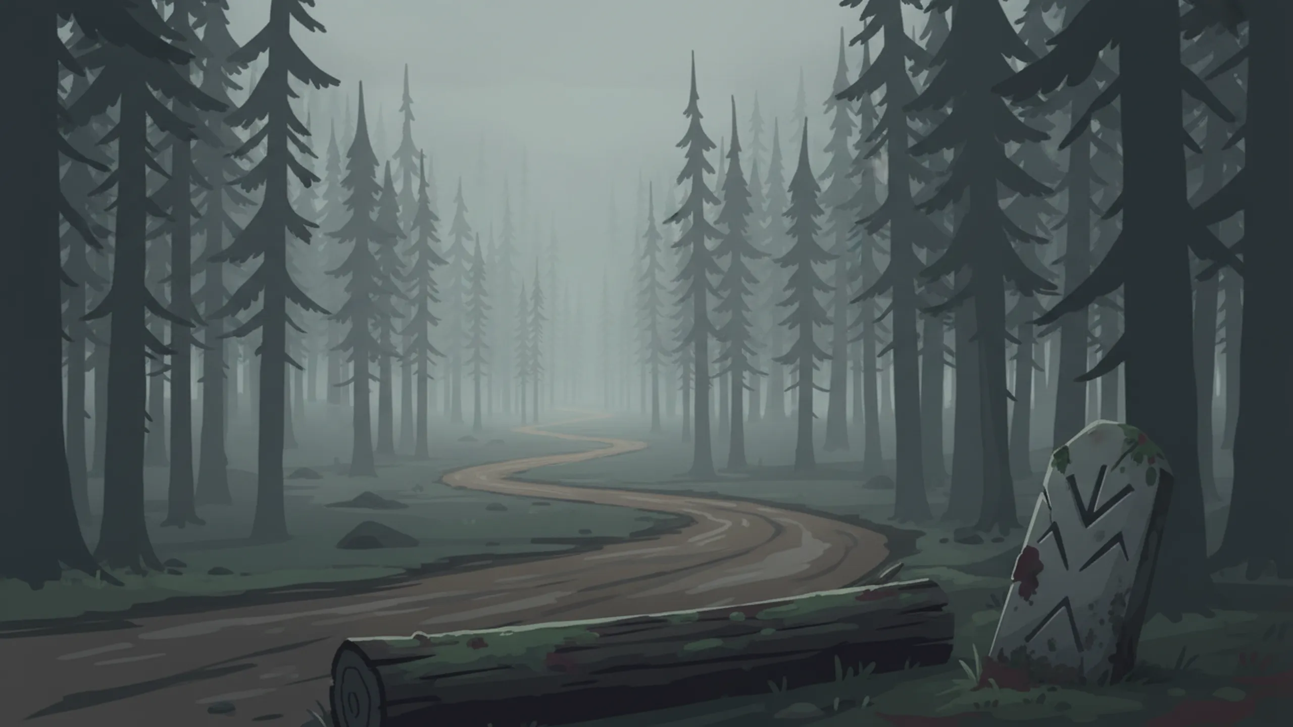
The Dreadmoor road — stable horizon, muted palette, and a composition that reads clearly even before anything happens on screen.
Characters as clean, readable portraits
Companions and NPCs follow the same rules in miniature: flatter values, broad brush regions, and just enough detail to read clearly at dialogue scale. Here are two companions built under the current standard:
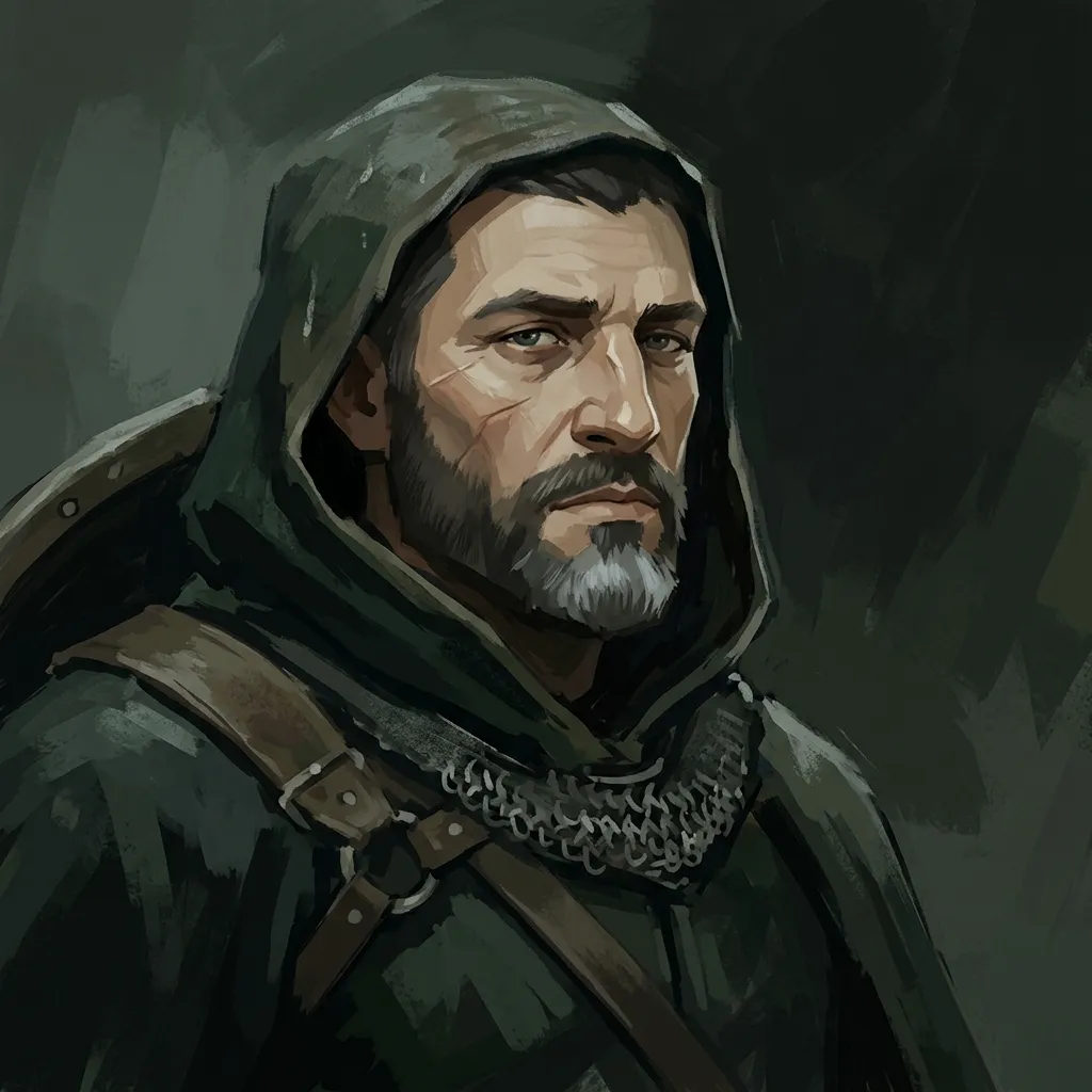
Rowan Ashguard.
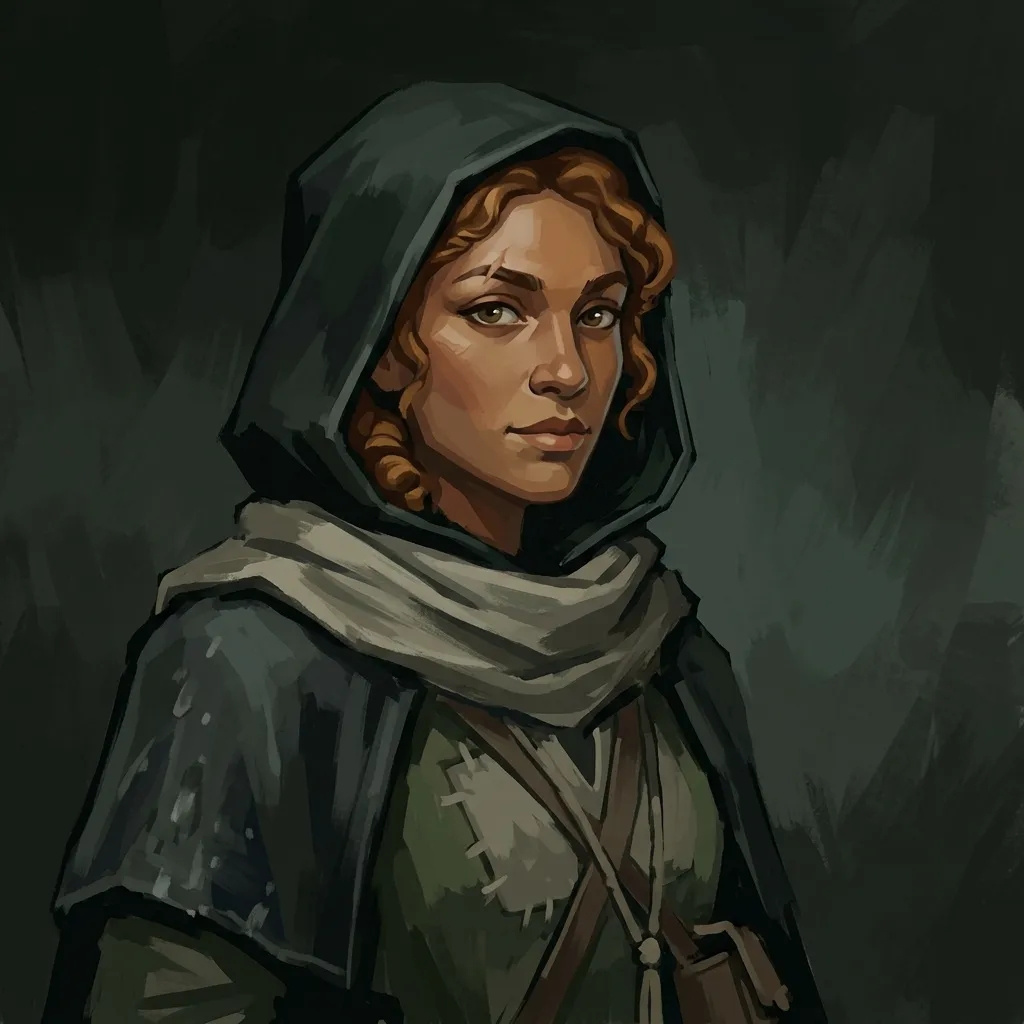
Lyra Threadcaller.
We keep coming back to the same test for a new portrait: does it still read clearly at dialogue-box scale, not just as a large splash image? If a portrait only works zoomed in, it isn’t finished yet.
Where this leaves us
None of this was a single decision — it was a lot of small course corrections that eventually added up to a canon we could point new work at. If you want to see it in motion rather than in stills, the conversation UI post covers how these same illustrated environments and portraits come together during dialogue. You can also read more about the game itself if you haven’t already.